If you are a professional designer, you must have heard a lot from your clients to “make the logo bigger”. That’s speaks volumes about the importance of visual hierarchy in website design.
Although content is still the king, no one wants to read anything on a poorly designed website.A website’s layout is crucial in making sure that your content is received well.
Every website owner must take note of the flow of information, layout, graphics, and structure of their site. By doing so, you ease readers into the information on offer without overwhelming them; thereby keeping interested to continue reading.
Most users understand and expect to see certain elements in certain places on a website.
For example, your logo typically resides in the same place on all pages of your site, often in the upper-left corner. It serves two functions up there. First, people will know that they’re on your site, which reinforces your brand. Second, it acts as a button to get back to the homepage from anywhere on the site.
These are just a few of the many reasons which establish the importance of visual hierarchy in website design. Let’s discuss some more prominent benefits of visual hierarchy in this blog.
But, first, a quick definition of visual hierarchy.
What is visual hierarchy?
In the simplest terms, a visual hierarchy is the organization and prioritization of content (including images and graphics) as a way to communicate a specific idea, thought, or message.
When it comes to setting the visual hierarchy, designers have to keep in mind the following crucial questions;
Where should the audience look first?
What’s the most important piece of information on this page?
What’s the best way to move the audience down the page?
Where’s the best place for a call-to-action?
What image or graphic will communicate the message best?
By laying out elements logically and strategically, designers influence users’ perceptions and guide them to desired actions.
Visual hierarchy can, very well, be described as the difference between a site that strategically influences user flow and decisions and a site that just “looks nice”.
As one of the most important principles behind good web design, it refers to the order in which the human eye perceives what it sees.
So, how do you establish a visual hierarchy in website design?
As explained earlier in this article, visual hierarchy is the process of setting a reading pattern for the website visitors in a way that they are able to consume the content information with ease.
F/E Pattern. The first reading pattern is largely seen for text-heavy websites like blogs. Users, start with scanning a vertical line down the left side of the text, looking for keywords or points of interest in a paragraph’s initial sentences. When the reader finds something they like, they begin reading normally, forming horizontal lines.
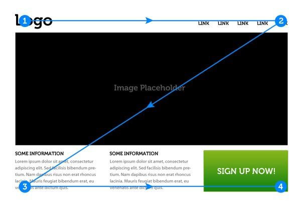
Z Pattern. As the name suggests, if you were to access a Z-Pattern website, your eyes would wander horizontally over the top; possibly drawn to the menu bar at first or simply because you’re used to reading from left to right. Once you reach the end, your attention shifts down and left (again based on reading habit), and repeats a horizontal search on the lower part of the page.
When you don’t follow a proper visual hierarchy in website design, it leaves your website visitors confused and uninformed. The viewer tries to take in all of the content at the same level of importance and leaves confused, without actually digesting much or any information.
Therefore, it is important that you diligently work on the visual hierarchy aspect of your UX/UI design as well.
Therefore, it is important that you diligently work on the visual hierarchy aspect of your UX/UI design as well.

Connect
Stay With Us
Subscribe to our news letter to get the lattst
new on Business
new on Business